Using PhotoShop Levels, Brightness, Variations, Saturation
First steps to improving the appearance of a photo
Here is an example of using the Levels, Brightness, Variations, and Saturation
tools in photoshop to improve the general appearance of a scanned photograph. Excluding
FocusFixer these are always the first steps you should
take when starting to work with a photograph. Of course this is a general rule,
and special instances may require different treatment.
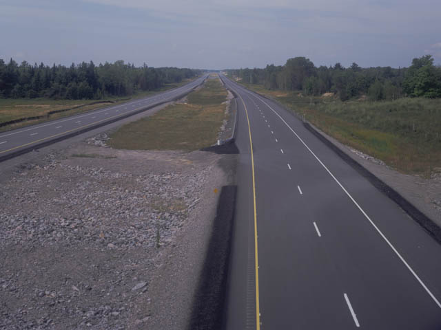
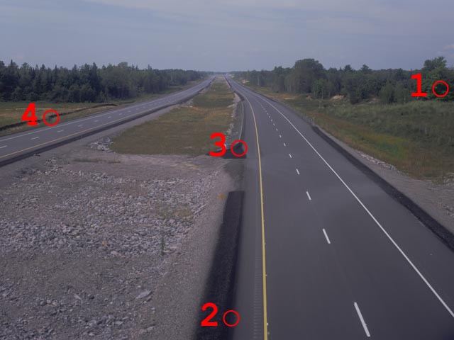
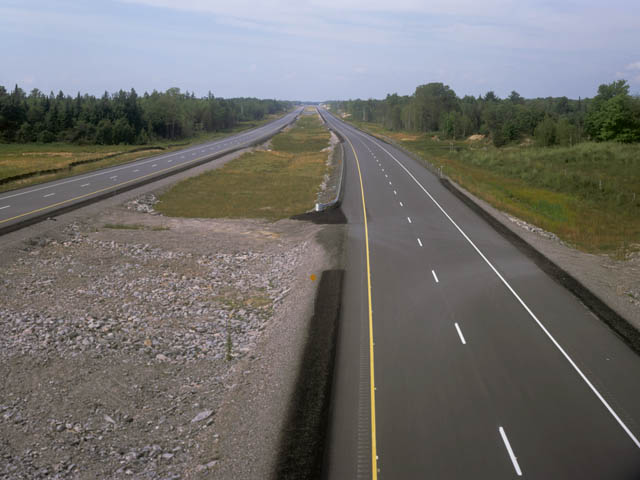
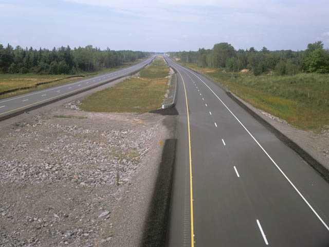
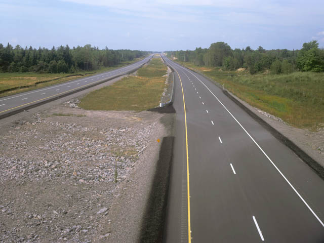
This first picture is what we are starting with. This is a small version of a
scanned 4x5 large format transparency. The colour and contrast in this picture is
terrible.
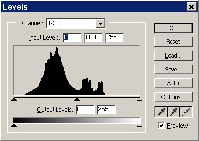
The first step, and sometimes the only step required, is to set to darkest and
lightest points in the picture. We will use the Levels tool to do this.
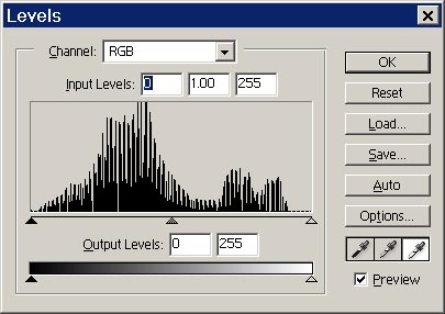
From the top menu select Image, then select Adjustments, then
select Levels. The following dialog will appear. The histogram looks
terrible, it should be more spread out.
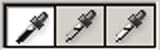
Double click on the dark eye dropper.
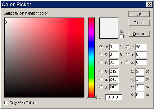
A colour selection dialog will appear. Set L=4, a=0, b=0, then click OK.
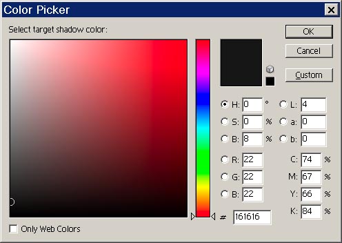
We are now ready to select the part of the photo that we want to be the darkest thing
in the final image. Some examples we would choose from are 1)Shadow in tress, 2)Black tar on asphalt,
3)Black tar in shadow, 4)Dark pollution abatement screens. I choose to use 3 by clicking the eyedropper
on the blackest tar.
Double click on the light eye dropper.
A colour selection dialog will appear. Set L=96, a=0, b=0, then click OK.
We are now ready to select the part of the photo that we want to be the lightest thing
in the final image. Some examples we would choose from are 1)White cloud in sky
(not very good in this picture), 2)Hi-light on guardrail, 3)White line on highway.
I choose to use 3 by clicking the eyedropper on the white line.
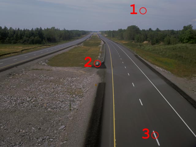
Our histogram now has some gaps in it, but it is spread out nicely.
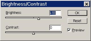
And the image is starting to look pretty good. It is however a little on the dark side.
We can now use the Brightness control to further improve the appearance of the photo.
From the top menu select Image, then select Adjustments, then
select Brightness/Contrast. The following dialog will appear.
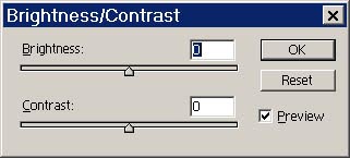
Increase or decrease the brightness setting until the overall image appears satisfactory.
So we now have the following image which is continuing to look better. The sky however
could use a little more blue.
We are going to use Variations to improve the appearance of the sky. However we must
first select the sky. To do this from the top menu select Select, then select
Color Range. The following dialog will appear. Within the preview window (mostly
black area in dialog) click on a portion of the sky.
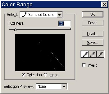
Once a portion of the sky is selected activate the addition eyedropper and then click
on portions of the sky which are still dark.
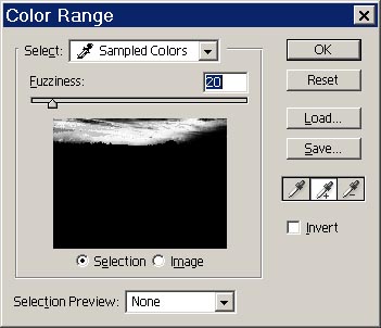
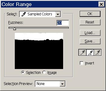
You should eventually have most of the sky selected as in the following dialog.
You may have to use the negative eyedropper, or other selection tools to complete
the isolation of the sky.
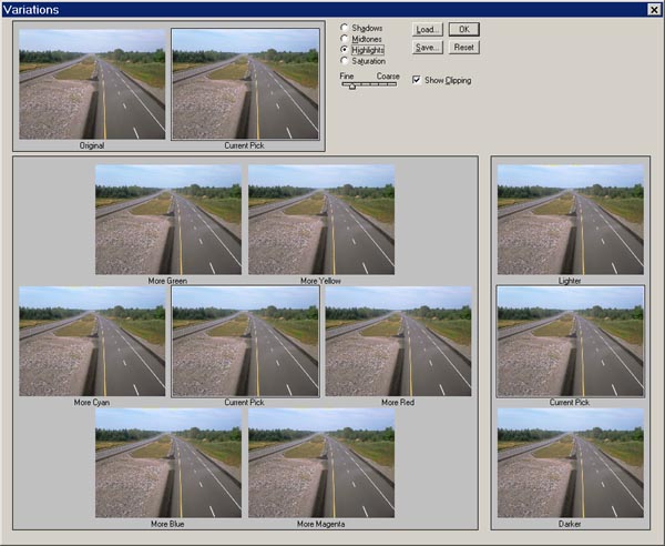
Now we will use the Variations tool. To do this from the top menu select Image,
then select Adjustments, then select Variations. The following dialog
will appear.
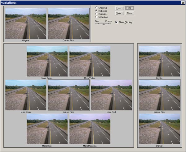
Move the fine course slider closer to fine. Play around with the different variatons
by clicking on the preview windows until you get a desirable result. Any time you
think you have gone too far you can click on the "original" preview window to reset
your changes. In the end I clicked twice on "More Blue", once on "More Cyan", then
after pressing the "Highlights" radio button I clicked once on "Lighter".
Now we have the following image in which the sky looks good, but for a little more
pop to the colour lets turn up the saturation a little.

Now we will use the Saturation tool. To do this from the top menu select Image,
then select Adjustments, then select Hue/Saturation. The following dialog
will appear.
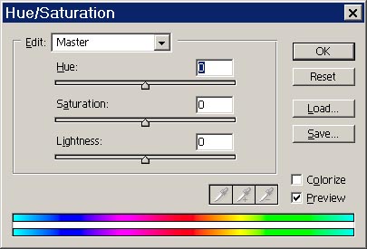
Increase or decrease the saturation setting until the overall image appears satisfactory.
You will often find the image starts to take on a false appearance if you add too much
saturation. Spend some time playing around with the setting. Once you think it looks
good drop a couple notches down and it will probably be better.
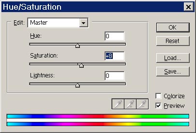
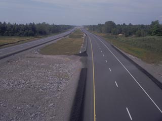
So once you click on OK, the saturation will be changed, and finally we have the following.
And here are the before and after of the original photograph.
 |
|
 |
| Before |
Highway 400
Much improved
|
After |
BACK
Greg R's Home Page
©Greg Roberts 2002